Dynamometer Test Stand: How to Read a Power Graph and What Else You Can See
Let's start with the graph.
The power measurement graph shows the engine's measured power and torque under specified conditions: throttle opening, load, and other parameters set by the dynamometer operator.
The power and torque indicators on the graph can be of two types:
a) At the wheel — i.e., accounting for losses in the transmission;
b) At the engine flywheel — i.e., without accounting for losses. This type of power on all wheel dynamometers is calculated and cannot be 100% accurate. We use wheel power in our graphs.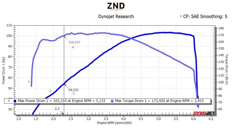
Typically, to demonstrate the engine's maximum capabilities, a fully open throttle with no load is used.
Let's look at the graph below.
On the X-axis — engine RPM, on the Y-axis (left) — power in horsepower, Y-axis (right) — torque.
Number 1 — torque curve;
Number 2 — power curve;
Number 3 — power measurement standard and smoothing degree (5);
Number 4 — torque value at a highlighted point on the graph (vertical line);
Number 5 — the same as 4 but for power;
Number 6 — values of selected parameters. Usually, these are the maximum power and torque and the RPM at which they are achieved.
Thus, with the graph, we can understand the engine's potential, its operating, and effective RPM range. The graph can also display a range of recorded parameters: from fuel-air mixture composition to ignition advance angles. However, this is for analysis rather than internet publication :)
Next...
Let’s examine familiar graphs from the previous article.
To recap, this is a 2020 Harley Davidson Low Rider S with an M8 114 Stage 2 engine.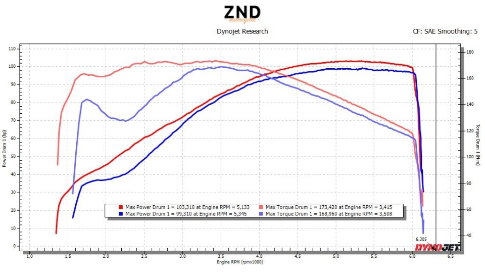
The first thing that stands out is the difference in torque/power readings in the RPM range up to 3,000. This indicates that at close to maximum values, the "blue" engine will likely be jerky in this range, requiring more active clutch use and being less comfortable for city or winding roads. There will be no "train-like" acceleration from near-idle speeds.
Second — the sharp torque spike after 2,500 RPM will add "exciting sensations," but also "blur" the rider's attention and make it harder to precisely modulate power and assess road conditions.
It’s also important to remember that these are the engine's MAXIMUM capabilities, and with smaller throttle openings, the "drop" issue will likely be even more critical.
Conclusions: To be fair, if this were a sports engine and the rider could maintain RPMs above 3,300-3,500, the dynamics would be comparable. Otherwise, the "red" engine will be quicker and more responsive, and consequently, more enjoyable to ride.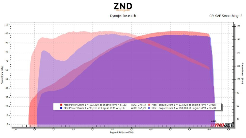
Above, we see the same graph but with the AUC option enabled, which effectively measures the area under the curve. It more clearly demonstrates the difference in potential, namely allowing for comparison of the amount of generated power.
351 vs. 379, which is a whole 8% more power, much higher than the 4% in extremes. The torque value will be even higher.
We can obtain additional information if we replace engine RPMs on the X-axis with time.
Next are graphs made during work with CB600. This is an old project, mentioned in previous articles, but it’s very illustrative for this publication.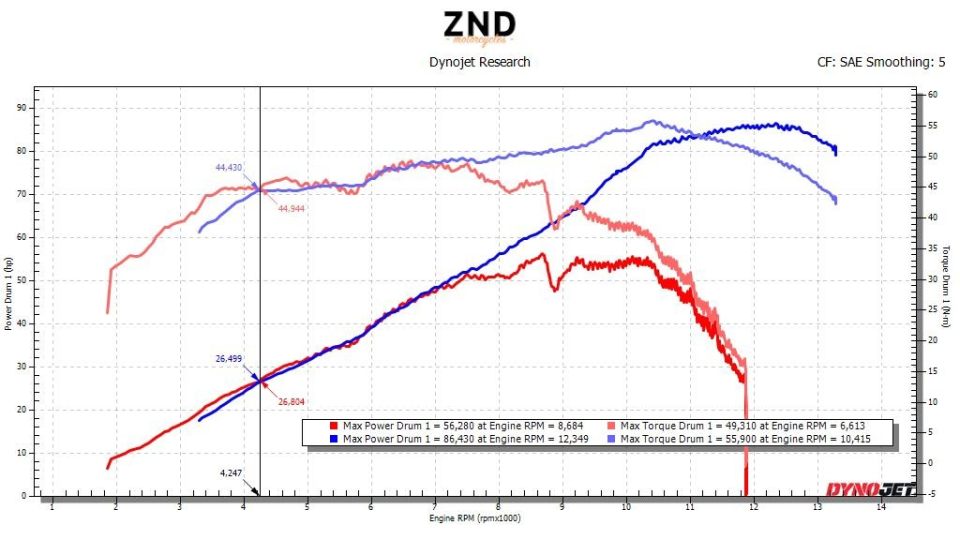
Comparison of power and torque before and after modifications with horizontal scaling in engine RPMs.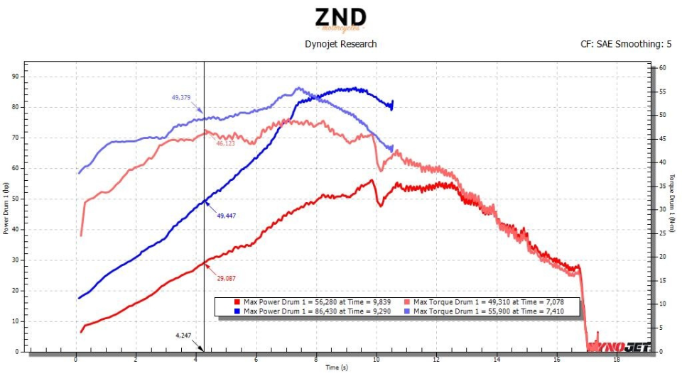
The same with time on the horizontal axis.
It’s evident that the engine is not only more powerful but also significantly faster in picking up RPMs. Yes, there is a considerable increase in power, but there are motorcycles that, with comparable generated power but different settings (and/or physical changes), have different speeds. This is also felt on the road.
We’ll conclude the general discussion and move to specifics.
Excerpt from the graph above. A "rattle" on the graph that even smoothing cannot address is a sign to consider. Most likely, the motorcycle has a technical problem. Depending on the nature of the rattle, this could indicate issues with ignition, fuel, or a loss of valve control, i.e., the timing mechanism needs attention. Or you might have over-revved the engine beyond its design limits.
Power measurement graph — how to compare engines, image №5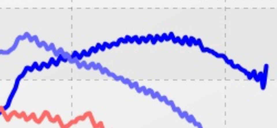
In this example, there was a problem with valve clearances and ignition.
Here’s an example of an absolutely "sick" engine, with a series of mistakes in its design. If you’re offered a "cool tuned engine" and provided with a graph of this type — don’t buy it) "It smells of kerosene."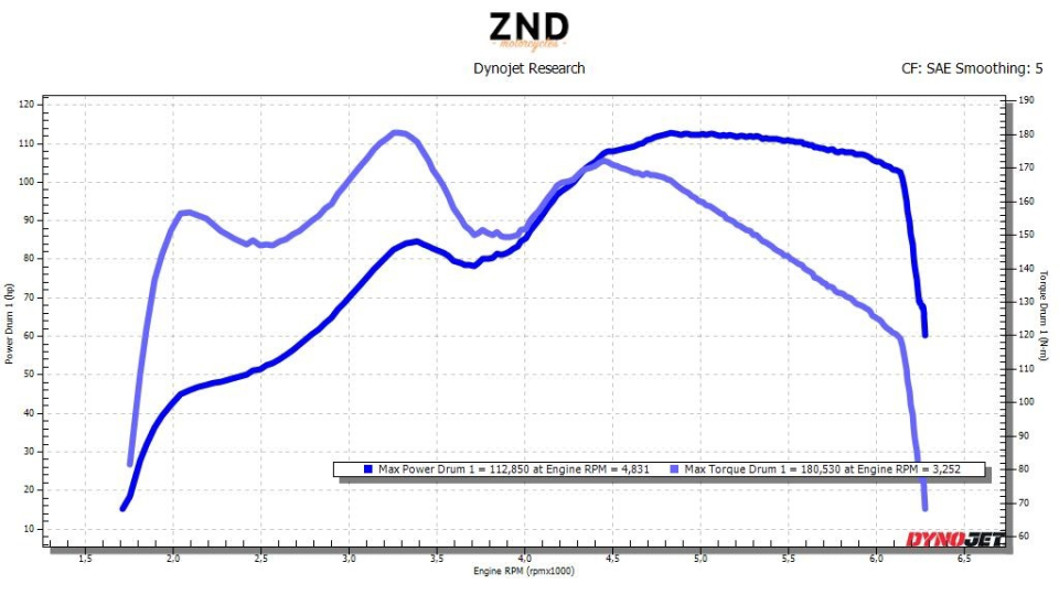
Sharp spikes and drops indicate enormous fluctuations in cylinder filling quality, likely due to resonances, flow disruptions, and other factors not related to tuning. Even with suboptimal mixtures and ignition, an engine won’t produce such "roller coaster" results.
Above, we discussed only two parameters: power and torque, but there are actually dozens more just from the control unit, not to mention the array of data provided by the dynamometer itself.
Below is an example of a "modest" ECU.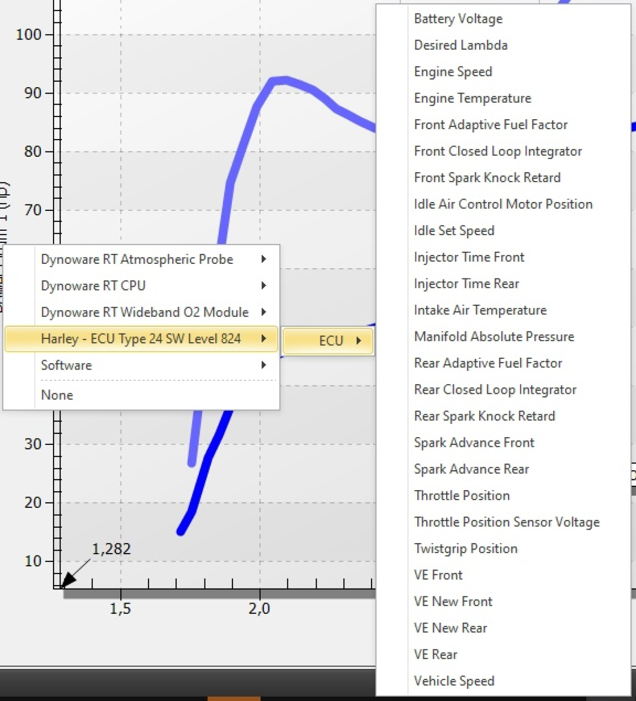
In terms of diagnostics, one hour on the stand is equivalent to days without it. Therefore, third-party workshops and service centers often turn to us to save client time and money.

 Follow
2.3K
Follow
2.3K